


Next: Final spectra
Up: A practical guide to
Previous: Example histograms
Here a few example plots are shown for the efficiency and
decay correction. The efficiency correction has a rather sharp rise at
the edge of the acceptance and is very close to 1 for most bins. The
decay correction has a slower evolution. Figure 5 gives
an impression of the overall behaviour of the correction with  ,
,
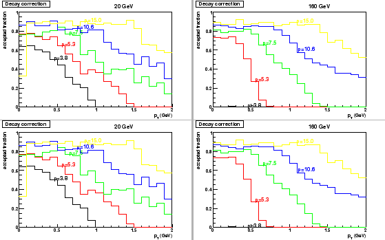
 . Figure 6 shows a few projections of the dcay
correction histogram in slices of total momentum .
. Figure 6 shows a few projections of the dcay
correction histogram in slices of total momentum .
Figure 5:
Example of tracking efficiency for non-decaying tracks (top
row) and the additional losses due to decays (bottom row) as a
function of total momentum and
. The left
panles show distributions for 20
 beams and the right panels
for 158
beams.
beams and the right panels
for 158
beams.
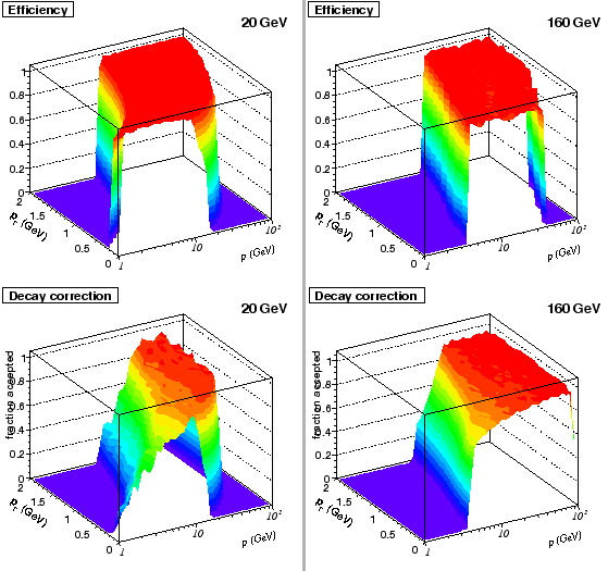 |
Figure 6:
Example of losses due to decays as a
function of
for various selections in total momentum. The
panels show results for 20, 30, 40 and 158
. Statistical errors
are omitted for clarity.
 |
Marco van Leeuwen
2009-01-14